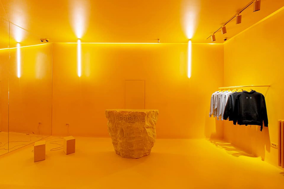
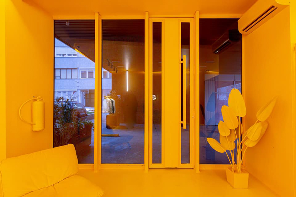
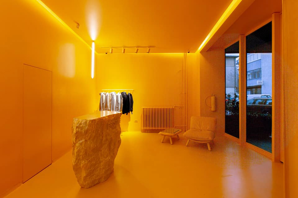
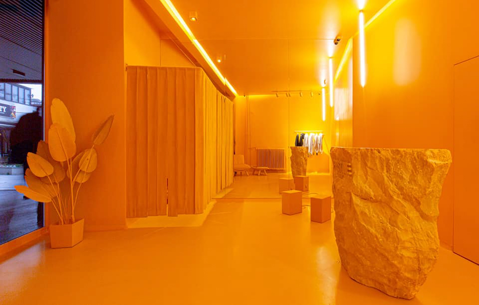
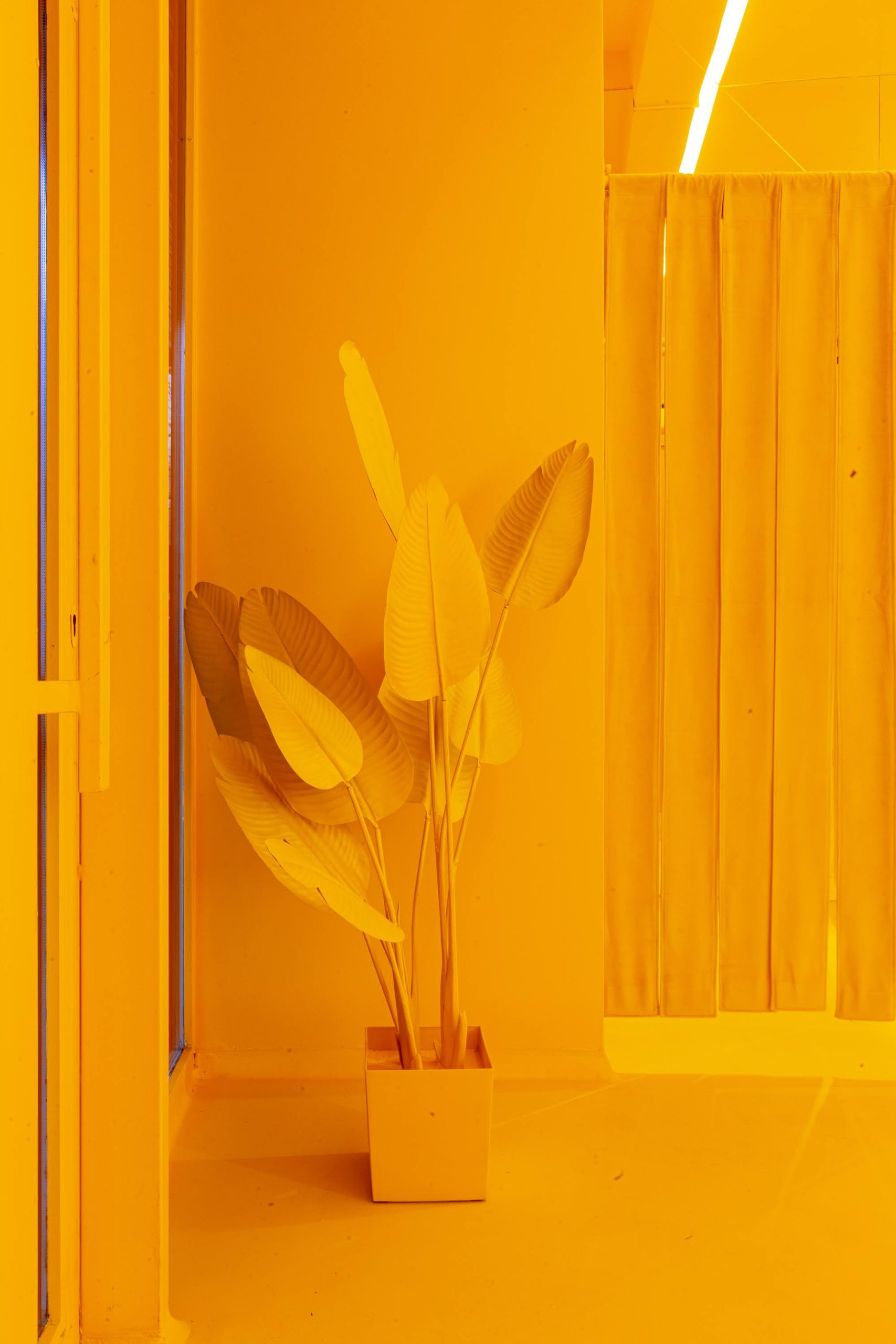
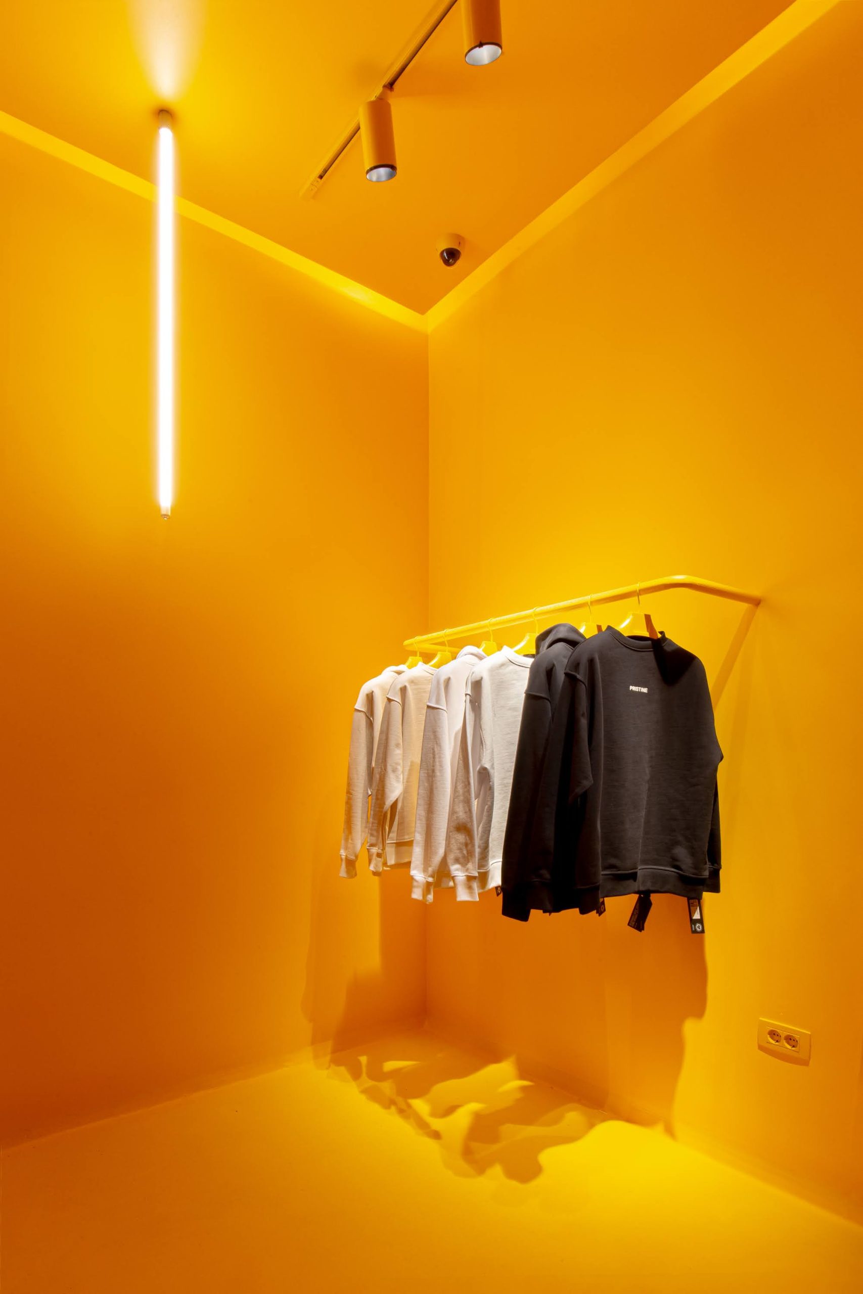
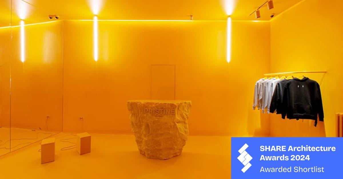
who gives a f*** about PANTONE color trends of this or any year… We wanted a yellowish orange color.. We didn’t want a counter, we wanted a rock as a testament of a new superbrand…his super clothing brand store has a unique and striking design, primarily featuring a bright yellow color scheme. The choice of yellow is intentional, as it is often considered one of the most disliked colors. This design decision aims to make the clothing items stand out more prominently against the vibrant background, ensuring they are the focal point for customers.Key features of the store include:Yellow Interior: The entire interior, including walls, ceiling, and floor, is painted in a vivid yellow hue. This creates a bold, monochromatic environment that is both eye-catching and unconventional.Minimalist Design: The store’s layout is minimalist, with few furnishings and fixtures. This minimalism further emphasizes the clothing items on display, avoiding any distractions.Strategic Lighting: Vertical light fixtures are strategically placed on the walls, adding to the modern and clean aesthetic of the store. The lighting also enhances the visual impact of the space, making the colors and textures of the clothes more apparent.Central Display: A large, rough-textured stone pedestal stands in the center of the store with the brand name “PRISTINE” engraved on it. This central element serves as a focal point and adds a touch of natural contrast to the otherwise stark yellow surroundings.Clothing Display: Clothes are neatly arranged on simple yellow racks along one wall. The clothing items, in neutral or dark tones like black, white, and gray, stand out sharply against the yellow background, drawing immediate attention.Overall, this store’s design is a bold statement in retail interior design, using an unpopular color to create a visually impactful space that ensures the clothing remains the primary focus.